

Humans are inherently visual. Did you know, about 83% of what humans perceive is based on sight? The remaining 17% is broken down among the other senses. Which is why we believe that visualising HR data (or any data in general) is essential for identifying important information when sifting through the data jungle! So, let’s explore some different ways you can visualise your organisation with org charts!
Hierarchy Structures
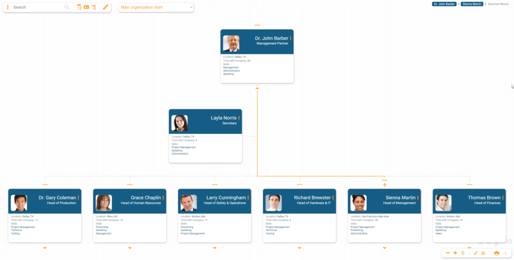
One of the most common visualisations for org charts is the hierarchy structure. Being able to see an entire organisation from top to bottom in a visual way makes it easy to understand relationships and reporting structures quickly. An org chart can show details such as employee pictures, team structures within groups, and other data, or it can be a simple hierarchy tree that allows for viewers to easily drill down into departments and command structures. Here’s an example of a hierarchy structure org chart:
Big Data
The visualisation of big data can be incredibly beneficial. Rather than working with spreadsheets and documents filled with numbers and text, creating a visual representation of your organisation’s data can make it easier to find information at a glance. Employee demographics such as gender or age, location and head count are just some of the data sets that can be visually represented.
Pro-tip: The larger your teams, the more data you most likely have available. However, that doesn’t mean you need to visualise your organisation including every single detail. Just focus on making your complex data more visual.
KPIs
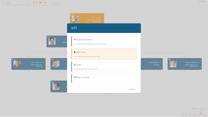
Integrating KPIs directly into your org chart gives HR and managers quick access to important information about teams and departments, facilitating the process of HR controlling. For example, if your organisation is looking to grow a department’s head count by the end of the year, showing the head count KPI right on the chart makes it easier to see how close you are to reaching your goal at a glance rather than drilling down into the department and manually counting the roles. Or, how about visualising each department’s budget to see at a glance if they are still on track?
Relationships
Relationships on an org chart can be different from a standard hierarchical structure. Visualising relationships that are cross-departmental, project-based, or otherwise outside of an employee’s regular reporting structure helps HR and managers see all areas of the organisation that an employee touches. For instance, you can create separate groups for these relationships or show the relationship through dotted lines.
Special Skills
Special skills can often be overlooked as an important part of org charts. Adding skills to your org chart can help HR or managers quickly find employees who fit certain descriptions or have a non-role-related skill without having to send out company-wide communications.
Keep track of who is certified for first aid, what additional languages anyone speaks, or what degrees your employees hold. And what about fun information for building your culture such as who enjoys playing soccer? The options for what you record are endless. A great option to visualise this kind of information easily is with the help of icons. Another way of quickly finding employees with special skills is by incorporating the search function. Find out more in our article, search and navigation.
Agile Teams
Since agile teams are dynamic-based on which roles are needed for projects at a certain time, visualising how they fit into your organisation can be very beneficial. There are a few ways you can visualise your agile team within your overall org chart. For example, try colour coding employees who are part of a team, creating completely separate groups for the agile team. Or giving iconographic indicators to these employees so that when you look at the organisation as a whole, you can delineate which employees are currently working on an agile project.
Set up views for different use cases
Learn tips and tricks for setting up multiple box views that visualise different information based on your use case.
To learn more about ways to visualise your organisation, check out two of our most popular org charting tools: